You've just finished something you're proud of. A novel, a chapter, a blog post, a report. Then you get to the part nobody warns you about: the title. You capitalise every word out of habit, pause on the small ones, second-guess whether "with" should be uppercase, wonder if your brand name breaks the rule, and by the time you publish you're not actually sure you got it right.
Neither are your readers. And that's the problem.
Title case looks like a tiny detail. It isn't. It's one of the first things a reader's eye lands on, and a wonky one quietly signals that the rest of the work might be wonky too. Worse, almost every style guide disagrees about how to do it, which is how two careful writers can capitalise the same headline two different ways and both believe they're correct.
This guide sorts it out. We'll start with what title case actually is and why it earns its keep, then move through the rules that govern it, the differences between the major style guides, the edge cases that trip up even seasoned editors, and a simple decision system you can run any word through in about ten seconds. It's written for an Australian audience, which matters more than you might think, because the default here isn't what most of the internet will tell you.
Let's get into it.
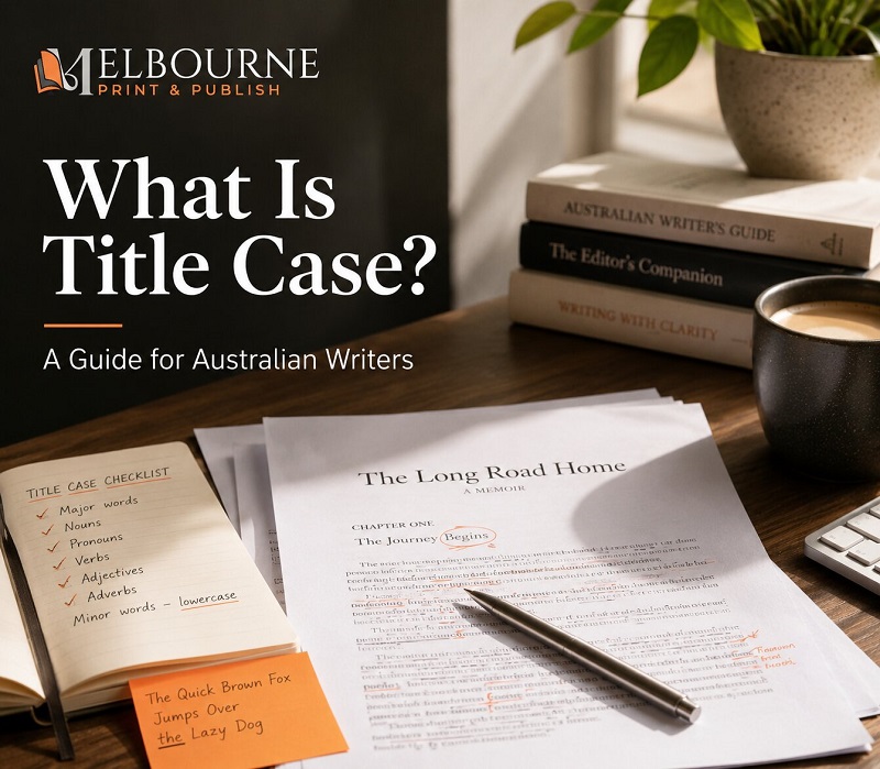
Title case is a style of capitalisation where you capitalise the first word, the last word, and all the major words in between, while leaving the minor words in lowercase. That's the title case meaning in one sentence. "The Catcher in the Rye" is title case. So is "How to Win Friends and Influence People." The big words stand up; the little connecting words sit down.
If you've ever searched for what is title case or what is title casing and come away more confused than when you started, it's usually because the explanations skip the why and jump straight to a list of exceptions. So let's do the why first.
Title case exists to do one job: signal that a string of words is a title. When you see "A Tale of Two Cities" with those initial capitals, your brain registers it as the name of a thing, not a sentence describing one. That visual cue carries weight. It says this is deliberate, this is finished, this is a work. It's the typographic equivalent of a firm handshake.
For anyone working with books, that handshake is non-negotiable on a cover or a title page. A reader makes a snap judgement about a book in a couple of seconds, and inconsistent capitalisation in the title is the kind of thing that registers before they can even explain why something feels off. This is exactly the territory a good editor watches, and it's why so many writers eventually hand the final pass to a professional editing team rather than trust their own tired eyes.
To understand title case properly, you need to see it next to its two siblings.
Sentence case is exactly what it sounds like. You capitalise the first word and any proper nouns, and everything else stays lowercase, just like a normal sentence. "How to capitalise titles correctly" is sentence case. It feels conversational, modern, and clean, and it's far easier to read at a glance. This is the Australian default, and we'll come back to that because it's the single most important local difference in this whole guide.
Title case, as we've covered, lifts the major words. It feels formal, authoritative, and traditional. It's what you expect on a book cover, a journal article, or a film poster.
All caps is every letter capitalised. THIS. It has its place on a short label or a button, but as a way of styling a title it's a blunt instrument. It's hard to read in long stretches, it strips out the shape of words that helps us read quickly, and overused it can actually fail accessibility checks because screen readers and low-vision readers both struggle with it. Use it sparingly, if at all.
The sentence case vs title case question is the one most people actually wrestle with, and the honest answer is that it depends on context and on which country you're writing for. Which brings us to the part most guides get wrong for Australian readers.
Here's the thing almost no US-written article will tell you. In Australia, sentence case is the standard, not title case.
The Australian Government Style Manual, the most authoritative reference we have, recommends minimal capitalisation. That means sentence case for headings, titles, and most content: capitalise the first word and any proper nouns, and leave the rest alone. The reasoning is sound. Sentence case is easier to scan, friendlier to screen readers, and less cluttered on a page. It's good for accessibility, and what's good for accessibility tends to be good for everyone.
Title case still has its place here, and we'll map out exactly where. But if you're writing for an Australian website, a government department, a corporate blog, or most digital content, your starting assumption should be sentence case. The title-case-everything habit so common online is largely a US convention, and importing it wholesale is one of the quietest mistakes Australian writers make. If you're publishing locally and want a deeper local walkthrough, our guide on how to capitalise titles goes further into the Australian specifics.
Capitalisation is a trust signal, and it works below the level of conscious thought.
When a reader sees a title that's been capitalised consistently and correctly, they don't notice it. That's the goal. Good formatting is invisible. But when they see "The" lowercased at the end of a title, or "To" sitting oddly capitalised in the middle of an infinitive, something snags. Most readers can't name what's wrong. They just feel that the work is slightly less careful than they hoped, and that feeling colours everything that follows.
For a self-published author, that's expensive. A reader who senses sloppiness in the title is primed to spot it everywhere else. For a marketer, an inconsistent set of headlines across a campaign chips away at credibility one impression at a time. For a student, a mis-capitalised title page can be the first thing an assessor sees before they read a word of the argument.
None of this is about being precious. It's about removing every small reason a reader has to doubt you. Consistency is the whole game.
Before the rules make sense, you need the vocabulary they're built on. Every title-case system, no matter which guide you follow, sorts words into two buckets.
Major words get capitalised. These are nouns, pronouns, verbs, adjectives, and adverbs. The words that carry the meaning. Importantly, verbs count even when they're tiny, so "is," "be," and "are" all get capitalised. People lowercase short verbs all the time because they look small and unimportant, but a verb is a major word no matter its length.
Minor words usually stay lowercase. These are the articles (a, an, the), the coordinating conjunctions (and, but, for, nor, or, so, yet), and the short prepositions (to, of, in, on, at, by, for). These are the glue words. They hold a title together without carrying its weight.
That's the engine. Now here's where the guides start to argue, because the exact line between "short" and "long" prepositions is precisely where they disagree, and one of the biggest guides just moved that line.
These are the rules that decide what words to not capitalize in a title and which ones to lift. Learn these and you'll handle the vast majority of titles without hesitation. We've kept the copy-chief's running commentary, because the rules only get you so far; knowing when they bend is the actual skill.
Position beats word type. The first word and the last word of a title get capitalised no matter what they are. Even if the last word is a humble preposition or article, up it goes.
So "The Day to Remember" capitalises "The" because it leads, and a title ending in "to Live For" capitalises "For" because it closes. This is why the answer to "should the be capitalised in a title" is: yes, when it's the first or last word; otherwise, usually not.
There's one exception worth knowing. APA style has no automatic last-word rule, which means a short preposition can legitimately end an APA title in lowercase. For everyone else, first and last words are sacred.
This is the heart of it, and it answers most of the specific questions people ask. Lowercase your articles (a, an, the), your coordinating conjunctions (and, but, for, nor, or, so, yet), and your short prepositions, unless one of them opens or closes the title.
So, should "and" be capitalised in a title? No, "and" stays lowercase in the middle. Should "on" be capitalised in a title? Usually no, it's a short preposition. Is "to" capitalised in title case? No, "to" stays down (more on the infinitive version of "to" in a moment). "Gone with the Wind" and "To Have and to Hold" both show the pattern: the glue words sit quietly while the major words stand.
Now the part that's genuinely changed. For years, the rule of thumb was "lowercase short prepositions, capitalise long ones," but the threshold for "long" depended on your guide, and one major guide just shifted it. As of the Chicago Manual of Style's 18th edition, released in 2024, Chicago now capitalises prepositions of five letters or more. That means About, Between, Through, and Without are now capitalised in Chicago style, where the old advice often left them lowercase. If you learned this rule a few years ago, that's the update to file away.
So the question "should with be capitalised in a title" or "should from be capitalised in a title" genuinely depends on your guide now. In AP and APA, words of four letters or more get capitalised, so "With" and "From" both go up. In Chicago, the cut-off is five letters, so four-letter prepositions like "With," "From," and "Over" all stay lowercase, while a five-letter one like "About" or "Between" is capitalised. In MLA, prepositions stay lowercase regardless of length. Same word, three different answers, which is exactly why "just pick a guide and stick to it" is the only sane advice.
Hyphenated words are where confident writers suddenly go quiet. The principle is straightforward; the exceptions are where guides diverge.
If both halves of the compound are equal, major words, capitalise both: "Well-Known Author," "Full-Time Job." If the second part is a glue word, it stays lowercase: "Run-of-the-Mill." Prefixes are where the guides have shifted recently, so check your edition. Chicago's 18th edition dropped its old dictionary-based prefix rule and now capitalises the second element outright: "Anti-Inflammatory," "Non-Traditional," "E-Commerce." AP, since 2023, likewise capitalises both parts of a hyphenated word, and APA capitalises both parts of a hyphenated major word. MLA is the holdout that still tends to lowercase the second part after a prefix ("Anti-inflammatory"). The practical takeaway: under current Chicago, AP and APA, capitalise both parts; only MLA leans the other way on prefixes.
When "to" pairs with a verb to form an infinitive, the "to" stays lowercase and the verb gets capitalised. "Born to Run." "How to Win Friends and Influence People." The "to" is doing quiet grammatical work, so it sits down, while "Run" and "Win" stand up as the major words they are.
The only time "to" gets capitalised is when it opens or closes the title, per Rule 1. Otherwise it stays lowercase, every time.
Subtitles bring their own question: what do you do with the first word after a colon or an em dash?
In AP, you capitalise the word after a colon if it begins a complete sentence, and lowercase it if it doesn't. In Chicago, you always capitalise the first word after a colon. And in Australian sentence case, you capitalise after a colon only when a full sentence or a title follows. So "Nexus: A Brief History of Information Networks" capitalises the "A" because it opens a subtitle, while a mid-sentence colon in plain sentence-case content might not.
Know which convention you're following before you reach for the shift key, because this is one of the most common points of inconsistency in long titles.
Some names break the rules on purpose, and you let them. Brand names and proper nouns keep their official styling even when it defies standard title case. "iPhone" keeps its lowercase "i." "eBay" keeps its lowercase "e." "O'Connor" keeps its internal capital. You don't tidy these up to fit the pattern; you reproduce them exactly as the brand or person uses them.
This is a small mercy, because it means you don't have to agonise. When a name has an official capitalisation, that's the answer. Copy it.
Rules serve readers, not the other way around. In digital publishing especially, if rigidly applying a rule creates a title that's ambiguous or awkward to read, make a deliberate exception and apply it consistently. A short preposition that's technically meant to stay lowercase can be capitalised if doing so prevents a genuine misreading.
The keyword there is deliberate. An intentional, consistent exception is a style decision. An accidental, one-off inconsistency is a mistake. Readers forgive the first and notice the second.
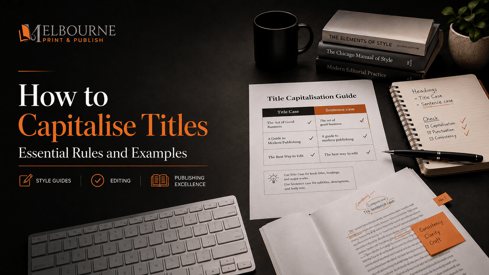
Here's where most confusion lives: titles and capitalization rules genuinely differ depending on which guide you follow. Sentence case is the Australian default, so reach for the comparison below only when title case is actually the right choice for the job. These rules reflect the current editions — the AP Stylebook (2024–2026), Chicago's 18th edition (2024), APA 7th edition, and MLA 9th edition but always confirm against the latest official guide, since editions change.
A quick note before the table: the "to" in infinitives stays lowercase across all of these guides, so we've left that column out to keep things readable.
| Style guide | Prepositions | Hyphenated compounds | First word after a colon |
|---|---|---|---|
| Australian Government Style Manual | Prefers sentence case; in title case, lowercase articles and prepositions | Follow general logic; replicate a published title exactly | Sentence case: capitalise only if a full sentence follows |
| AP (2024–2026) | Lowercase words of 3 letters or fewer; capitalise 4 or more | Capitalise both if equal words; also capitalise the second element after a prefix | Capitalise if it begins a complete sentence |
| Chicago (18th ed., 2024) | Lowercase prepositions under 5 letters; capitalise 5 or more (NEW) | Capitalise both if equal words; capitalise after a prefix unless the dictionary lists it unhyphenated | Always capitalise the first word |
| APA (7th ed.) | Lowercase words of 3 letters or fewer; capitalise 4 or more | Capitalise both parts of major hyphenated words (Self-Report) | Capitalise the first word |
| MLA (9th ed.) | Lowercase prepositions of any length | Capitalise the second element if it's a major word; lowercase particles | Capitalise the first word |
A note worth pinning up: verify rules against the current edition. The AP Stylebook updates roughly every year (the current run is the 2024–2026 edition), and Chicago moved to its 18th edition in 2024, which is what changed the preposition threshold. For Australian content, default to the Australian Government Style Manual and check spelling against the Macquarie Dictionary. If you're writing for a university, confirm whether the department follows APA 7 or MLA 9, because that single fact decides half your formatting.
You don't choose a style guide by preference. You choose it by context. Here's the quick map.
Australian government, corporate, and most web content follows the Australian Government Style Manual, which means sentence case. Journalism, media, and PR follow the AP Stylebook. Book publishing, trade publishing, and fiction follow the Chicago Manual of Style. Social sciences, education, and psychology follow the APA Publication Manual. Humanities, literature, and cultural studies follow the MLA Handbook.
For your primary sources, the Australian Government Style Manual at stylemanual.gov.au and the Macquarie Dictionary are the two you'll lean on most as an Australian writer. The Chicago Manual of Style Online and the AP Stylebook are your references for international rules, and the Purdue Online Writing Lab is a reliable free spot for a quick, verified academic answer. If you're a novelist deciding how to structure a manuscript before you ever worry about its title, our walkthrough on how to outline a novel is a better starting point than any style guide.
Rules stick when you see them applied. Here are before-and-after corrections across the contexts where capitalisation matters most.
This is the high-stakes arena, because a mis-capitalised title is the first thing an editor or assessor sees.
"the catcher in the rye" becomes "The Catcher in the Rye." "a tale of two cities" becomes "A Tale of Two Cities." "cloudstreet" becomes "Cloudstreet," because even a single-word title takes an initial capital. And "the great depression in australia" becomes "The Great Depression in Australia," capitalising the proper noun and the major words while leaving "in" lowercase as the short preposition it is.
These look obvious once corrected, but the lowercase originals are exactly the kind of thing that slips through on a tired final read and triggers an editorial flag on a manuscript submission. For fiction writers who'd rather hand the whole manuscript to a specialist than chase every comma and capital themselves, a fiction ghostwriting service can take the draft from rough to ready; non-fiction authors have the same option through a dedicated non-fiction ghostwriting service. And if your manuscript is fundamentally sound and just needs that ruthless final pass, our book proofreading service is built for exactly that stage.
When you cite the rules in your own writing, lean on primary sources, the Australian Government Style Manual, the Chicago Manual of Style 18th edition, the AP Stylebook, the MLA Handbook 9th edition, and the APA Publication Manual 7th edition, rather than second-hand summaries. It's the difference between sounding authoritative and sounding like you skimmed a forum.
Digital titles add a twist: they have to please both the capitalisation rules and the search engine.
"how to write a blog post that ranks" becomes "How to Write a Blog Post That Ranks." Note "That" gets capitalised, because it's a pronoun doing major-word work, not a glue word. "the ultimate guide to on-page seo" becomes "The Ultimate Guide to On-Page SEO," with "SEO" in caps as an initialism and "on-page" handled as a hyphenated compound.
For H2 and H3 subheadings, though, sentence case is often the better call. It's easier to scan, it reads more naturally on a screen, and it suits the accessibility-first approach Australian style favours. A common, clean pattern is title case for the H1 and sentence case underneath, but plenty of Australian sites run sentence case throughout for consistency. If your blog is part of a wider plan to get a book discovered, it's worth thinking about how titles, headlines, and metadata work together as part of your broader book marketing rather than as isolated decisions. The same care extends to your platform itself; a well-built author website keeps your heading styles consistent so you're not re-deciding the rules on every page.
Marketing channels are where the rules meet human behaviour. "sign up now and get a free gift" becomes "Sign Up Now and Get a Free Gift," capitalising "Up" because here it's part of the verb phrase "sign up," not a stray preposition. "what you need to know about tax time" becomes "What You Need to Know About Tax Time," with "to" lowercase and "About" capitalised under the four-or-five-letter rules.
A genuinely useful exercise for a content team is a spot-the-error headline challenge: take three real headlines, anonymise them, and have everyone diagnose the capitalisation before you reveal the fix. It turns an abstract rule into muscle memory faster than any cheat sheet. You could even mock up a search results page comparing a title-case headline against a sentence-case one to see which earns the click and which reads cleaner.
Most titles are easy. Then you hit one of these and the whole thing stalls. Here's how the professionals handle the awkward ones.
Prefixes like anti-, co-, pre-, and post- attached to another word used to be a recurring headache, because the guides split. As of Chicago's 18th edition that's largely settled: Chicago now capitalises the second element ("Anti-Inflammatory," "Co-Author," "Pre-Existing"), having dropped the old dictionary test, and AP and APA capitalise both parts too. MLA is the main exception that still often lowercases the second part ("Anti-inflammatory"). So the safe default under Chicago, AP and APA is to capitalise both parts, and to check MLA specifically if that's your guide.
The related skill here is knowing how to handle the shortened forms that pepper modern titles. If you find yourself unsure whether to cap an initialism or how to treat an acronym mid-title, our breakdown of abbreviations, acronyms and initialisms covers the correct usage in detail.
When a title borrows from another language, you have to decide whether to apply English title-case rules or honour the source language's conventions. "C'est la Vie" gets the English treatment in most title-case contexts. "Doppelgänger" keeps its umlaut and its single capital as a borrowed noun. Latin expressions like "In Situ" are usually capitalised when they function adjectivally or adverbially in a title.
The rule of thumb: apply English capitalisation unless the term is a proper noun or a fixed foreign phrase with its own settled styling. When in doubt, the Macquarie Dictionary will tell you how a loanword has settled into Australian English.
Complex titles with a colon, an em dash, or a series structure need a steady hand. Take a constructed example like "Harry Potter and the Philosopher's Stone: The Untold Story" — we've added the subtitle purely to show the mechanics, since the book itself has none. Note the Australian and UK spelling, "Philosopher's," not the American "Sorcerer's," which matters when you're replicating a published title for a local audience. The main title follows standard rules, "and" and "the" sit lowercase in the middle, and the subtitle after the colon starts with a capital.
Series formatting, alternative titles, and anything with multiple parts all follow the same logic: treat each segment as its own little title, capitalise its first word, and keep the glue words down in between.
Names with particles and apostrophes are their own small world. "de Gaulle" keeps its lowercase "de" in running text, though it's capitalised if it opens a title. "van der Waals" follows the same pattern. "O'Connor" keeps its internal capital, and "McDonald's" keeps both. The principle is consistent: a person's or brand's name is styled the way they style it, full stop, and your title-case rules bend around that, not the other way around.
We've established that sentence case is the Australian default. But "default" doesn't mean "always." Knowing when to switch is what separates a writer who follows rules from one who understands them.
One of the most practical uses of these two styles is contrast. Use title case for your H1 and sentence case for the H2 and H3 subheadings beneath it, and you create a visual hierarchy that helps readers see the structure of a page at a glance. The eye reads the title-case H1 as "the big one" and the sentence-case subheads as "the supporting points," all without a single extra design element.
That said, plenty of Australian organisations run sentence case the whole way down for a cleaner, more accessible look, and the Government Style Manual would back them. Either approach works. What doesn't work is mixing them at random. Pick your pattern and hold it. Consistent heading styles are also a big part of why properly formatted books feel effortless to read, which is the entire point of professional book formatting and, for digital editions, careful e-book formatting.
Sentence case is the stronger choice more often than most writers assume. It wins for Australian government and corporate web content, where it's the standard. It wins for email subject lines in conversational campaigns, where title case can feel stiff or shouty. It wins for UI labels and button text, where brevity and clarity beat formality. And it wins for social media posts aiming for intimacy and connection rather than authority.
The common thread is tone. Sentence case feels like a person talking. When that's the effect you want, it's not a compromise, it's the right tool.
There are places where title case isn't optional. Book covers and formal report titles expect it. The titles of Acts and legal case names use it. Journal-article submissions and academic essay title pages require it, and getting it wrong can genuinely cost you marks or a desk rejection. The way a title looks on a finished cover is part of the book's whole visual identity, which is why cover and interior decisions usually sit together under professional book design, and why illustrated titles often involve a specialist for the artwork through a book illustration service.
In these formal contexts, the authority that title case signals is exactly what you're going for. Reach for it deliberately, apply your chosen guide's rules, and don't second-guess it.
When a title fights you, don't argue with it word by word from memory. Run it through a system. Here's one that resolves almost any case in seconds.
Take any single word in your title and ask, in order:
Six questions, and you've correctly handled any word in any title. Drawn out as a flowchart with simple yes/no branches, it's the kind of thing worth keeping near your desk, especially one that scans cleanly on a phone for when you're editing on the move.
Software earns its place here, as long as you know its limits. Online converters and editing tools dramatically reduce human error on the mechanical stuff, but they can't read context, so they'll never fully replace a manual review on anything that matters.
Capitalize My Title is a solid converter that supports AP, APA, Chicago, and MLA, so you can test a headline against a specific guide in real time. Grammarly is useful for catching capitalisation and consistency issues while you draft, just set the dialect to English (Australia) so it stops trying to Americanise your spelling. ProWritingAid is the one to run a finished document through for a deeper style and consistency report. And the built-in tools in Word and Google Docs will flag the basics in early drafts, again, set the language to English (Australia) first. Trust automation for the rote checks; trust a human for the judgement calls.
The fastest way to stop arguing about capitalisation is to decide once and write it down. A one-page house style guide does more for consistency than any amount of rule-memorising, because it removes the decision from every future title.
Your one-pager needs three things. First, your chosen style guide and edition, for Australian teams, start with the Australian Government Style Manual. Second, your title case versus sentence case decision by channel: what you use for the blog, for email, for reports, for social. Third, your exceptions for brand names and product lines, so nobody has to relitigate whether your product's lowercase "i" is intentional.
That single page turns a recurring debate into a settled fact, and it scales across a whole content library without you having to be in the room.
A style guide is only as good as its upkeep. Every quarter, run a quick audit of your existing content and flag the drift: inconsistent H1 formatting, brand names capitalised three different ways, references to a style guide edition that's since been updated. Uneven formatting across a library signals a lack of polish, and over time it quietly erodes the editorial trust you've worked to build.
It's not a glamorous task. It is, however, one of the highest-return habits a content team can keep, because it catches small inconsistencies before they harden into "the way we've always done it."
If you remember nothing else, remember these four things. First and last words are capitalised in almost every guide. Know your guide's specific preposition threshold, and note that Chicago's is now five letters. Preserve official brand capitalisation exactly as it's given. And for Australian content, your default is sentence case, with title case reserved for the formal contexts that genuinely call for it.
Title case looks like a small thing, and in isolation each decision is. But across a finished book, a content library, or a marketing campaign, those small decisions add up to either a polished, trustworthy whole or a slightly-off one that readers feel before they can name. The good news is that it's entirely learnable, and you now have the rules, the guide differences, the edge cases, and a system to run any word through.
Bookmark this, keep the decision tree handy, and run your next title through it before you publish. And if you'd rather hand the whole job to people who do this every day, from the writing to the editing to the finished printed book, the team at Melbourne Print and Publish offers full publishing support, including academic proofreading for students wrestling with APA and MLA title pages, book printing for authors ready to hold the finished thing, ghostwriting for those who'd rather tell the story than format it, and book trailer video for launching it to the world. If you're going the independent route, our guide on how to self-publish a book in Australia and our explainer on what proofreading actually involves are both good next reads.
Title case is a capitalisation style where you capitalise the first word, the last word, and all the major words in between, while leaving minor words like articles and short prepositions in lowercase. In Australia, it's used selectively rather than as a default. Reach for it on book covers, formal report titles, the titles of Acts and legal cases, journal-article submissions, and academic essay title pages. For most other content, especially websites, government material, and digital writing, Australian style favours sentence case instead.
Title case capitalises the first word, the last word, and every major word in a title, so it looks formal and authoritative: "The Catcher in the Rye." Sentence case capitalises only the first word and any proper nouns, exactly like an ordinary sentence, so it reads as cleaner and more conversational: "The catcher in the rye." Title case suits formal and published titles; sentence case suits headings, web content, and anything where readability and a natural tone matter most. Sentence case is the Australian default.
Start by choosing your context. For most Australian content, use sentence case: capitalise the first word and proper nouns, and leave the rest lowercase. When a formal context genuinely needs title case, capitalise the first and last words and all major words, keep articles, coordinating conjunctions, and short prepositions lowercase in the middle, and follow your chosen guide for the finer points. Throughout, use Australian spelling, check terms against the Macquarie Dictionary, and lean on the Australian Government Style Manual as your primary reference.
In title case, the words you generally leave lowercase are articles (a, an, the), coordinating conjunctions (and, but, for, nor, or, so, yet), and short prepositions (to, of, in, on, at, by). The catch is that they only stay lowercase in the middle of a title; if any of them is the first or last word, you capitalise it. Major words, nouns, pronouns, verbs, adjectives, and adverbs, are always capitalised, even short ones like "is" and "be."
No, not in the middle of a title. "And" is a coordinating conjunction, which is a minor word, so it stays lowercase, as in "Pride and Prejudice." The only time you capitalise "and" is if it happens to be the first or last word of the title, which is rare but follows the first-and-last-word rule.
It depends on where it sits. "The" is an article and a minor word, so in the middle of a title it stays lowercase: "Gone with the Wind." But if "the" is the first word of the title, you capitalise it: "The Great Gatsby." The same applies if it's the last word. Position decides it.
Generally no. As a short preposition or as part of an infinitive, "to" stays lowercase: "How to Win Friends and Influence People," "Born to Run." The verb that follows the infinitive "to" does get capitalised, because it's a major word. The only exception is when "to" opens or closes the title, in which case the first-and-last-word rule lifts it.
This is where your style guide matters, because they disagree. In AP and APA, words of four letters or more are capitalised, so "With" and "From" go up while the three-letter "On" stays down. In Chicago's 18th edition, the threshold is five letters, so four-letter prepositions like "With," "From," and "Over" stay lowercase, and only prepositions of five letters or more (such as "About" or "Between") are capitalised. In MLA, prepositions stay lowercase regardless of length. Decide which guide you're following first, then apply its rule consistently.
APA style title case capitalises the first word of the title and any subtitle, all major words, and any word of four letters or more, including the second part of a hyphenated major word like "Self-Report." It lowercases articles, short conjunctions, and prepositions of three letters or fewer. One quirk to remember: APA has no automatic last-word rule, so a short preposition can legitimately end an APA title in lowercase. Australian students should confirm whether their institution uses APA 7 or MLA 9 before formatting anything, since the two differ.
The single biggest one is defaulting to title case everywhere out of habit, when Australian style actually favours sentence case for most content. After that: lowercasing the last word when it's a short preposition (it should be capitalised), and the opposite mistake leaving short verbs like "is" or "be" in lowercase because they look small, when they should be capitalised. Then there's mishandling the first word after a colon, "tidying up" brand names like "iPhone" into standard capitalisation, and applying an outdated Chicago rule now that the 18th edition capitalises prepositions of five letters or more. Almost all of them come down to the same fix: pick one guide, write your rule down, and apply it consistently.
Learn what title case is, how it differs from sentence case, and how to capitalise titles correctly in Australian English, with rules and examples.....
.webp)
Practical methods, beat sheets and Aussie tips to outline a novel from logline to scene list. Build a working roadmap with Melbourne Print and Publish....
Which words do you capitalise in a title? Learn the AP, Chicago, APA and MLA rules, then format any heading with confidence using this clear, full guide.....

Discover magical realism through a clear diagnostic framework. Learn its key traits, narrative techniques, and how to identify it across global fiction.....